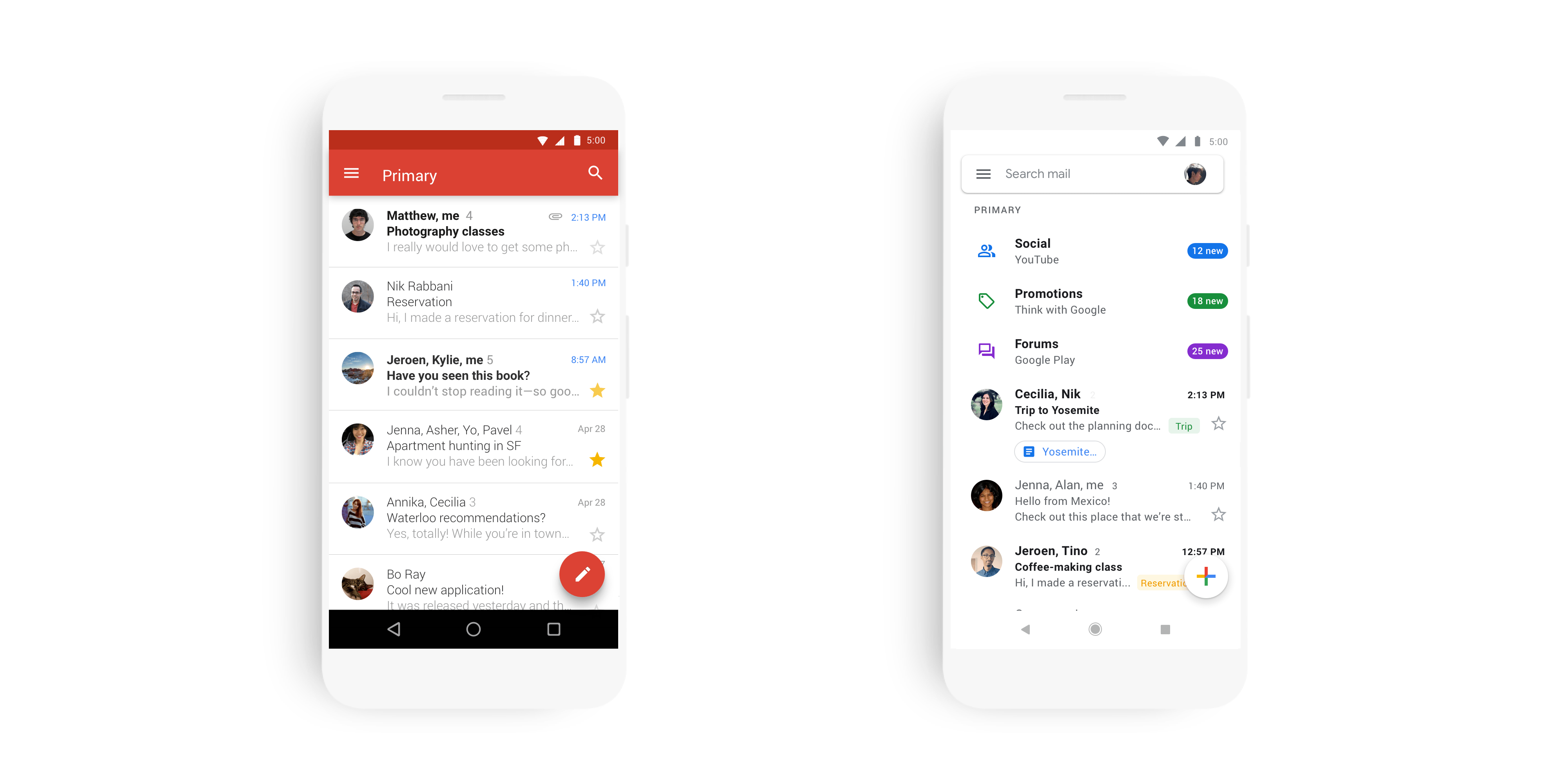
After being unveiled at Cloud Next 2018 in July, Material Design theme redesign for Gmail on Android and iOS is finally hitting users. It brings a lot of the features seen in the web version introduced last year. The familiar red app bar and accent has been removed and replaced with a stark white motif. You get a search field with the hamburger button on the left and profile icon on the right. The bottom right corner has the button you can access to compose messages. It’s now easier to see labels and other colours with the new design. Photos, documents, and other attachments are now seen inline for easier access. For “dangerous” messages, you’ll see big red banner warnings. Similar to the web, there are three density views for Gmail: Default, Comfortable, and Compact. The update is rolling out in the coming weeks, so keep an eye out for the change to hit your device soon.
Source: 9to5Google